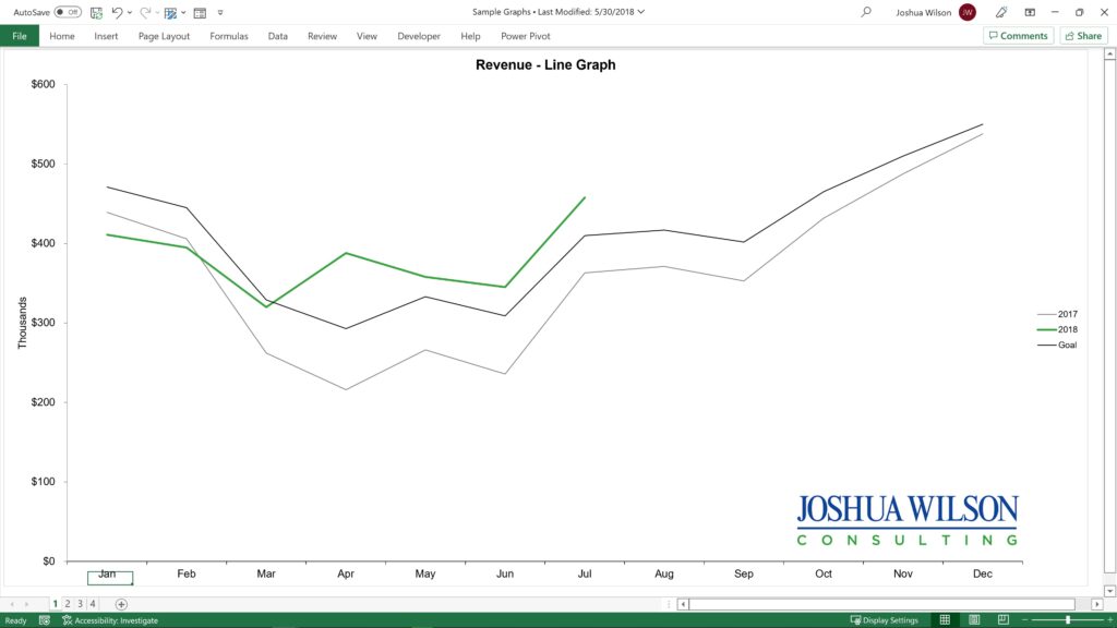
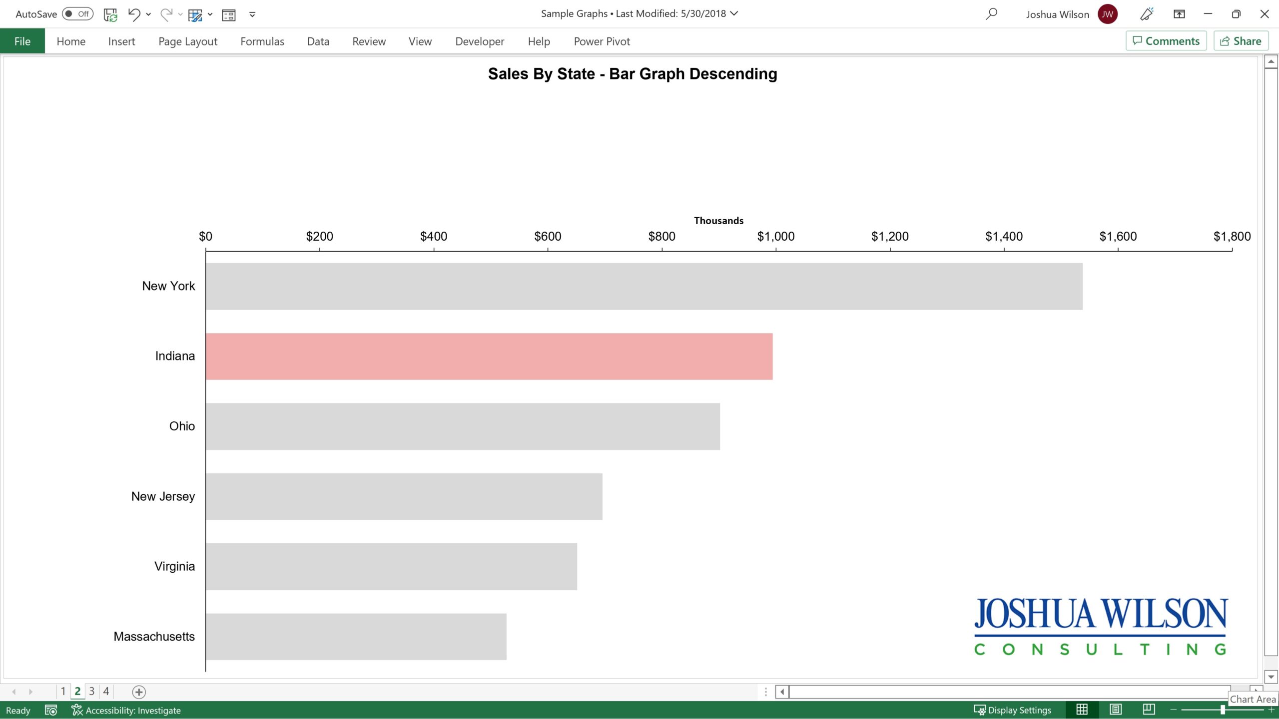
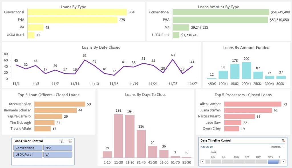
A Common Business Problem
Your business has multiple key metrics and a lot of moving parts. You’re tired of looking at reports from multiple sources. The reports aren’t standardized, the fonts and spacing are hard to read, and the color sometimes distract you. You don’t have the time to spend cross-referencing reports and data sources. At the end of a long workday, you don’t have the energy to mentally calculate trends. You recognize red flags for your business, but the days aren’t long enough to comb through the numbers to identify them all. And you have a vague feeling that you’re not getting as much as you could out of your data.
A KPI Dashboard Solution
Your Excel dashboard is a single-screen display. Your dashboard is standardized, simplified, and gives you trustworthy results. You control your Excel dashboard. Focus in or out of date ranges or business segments with Excel slicers and timeline controls. You’re the pilot in your cockpit, and these are your instrument controls. You’ll spot turbulence before it’s upon you, and you’ll have time to change course. As you grow familiar with your dashboard, you’ll recognize potential trouble at a glance.
Your dashboard brings your data to life. A glance at your Excel dashboard is a glance at the state of your business. Your Excel dashboard tells the story of your data. Your dashboard gives you the best graph for each key performance indicator (KPI). Your Excel dashboard designer provides the optimal layout to most efficiently communicate the story of your business.
You get professional Excel dashboard consultants. Your Excel dashboard pro’s eye for design and experience gives you a leg up. Your Excel dashboard designer has studied dashboard pioneer Stephen Few and follow his best practices. Your dashboard is high on data and low on ink, minimizing distractions to improve your focus. Your dashboard has discerning use of color. If everything is bright, nothing stands out. Your Excel dashboard designers use light colors strategically coordinated so you intuitively understand.
Your Excel dashboard design comes last – or first! Typically, dashboard design is the final step – after data is organized, cleansed, and KPI’s are defined. But if you already know what you need to see, your dashboard designer will develop a dashboard mockup, then work towards that goal throughout the project. Whatever stage you’re in, your dashboard team provides immediate insights to improve the bottom line.
Google Sheets Dashboard Design
Prefer to have a custom Google Sheets dashboard? No problem. Our dashboard designers can deliver custom Google Sheets dashboards, custom Microsoft Excel dashboards, or both.
Put our custom Excel dashboard (and Google Sheet dashboard) design team to work for you today.
Benefits Of Your Excel Dashboard Consulting Solution
Your dashboard saves you time, energy, and frustration. You gain accuracy and confidence. Your dashboard empowers you, focuses you, and keeps you free of distraction. Your dashboard is efficient and you will understand it intuitively. Your dashboard brings you business relaxation.
Your dashboards focus your attention on the areas of your business that need attention. Your dashboard shows trends, compares performance to objectives, and alerts you to peril.
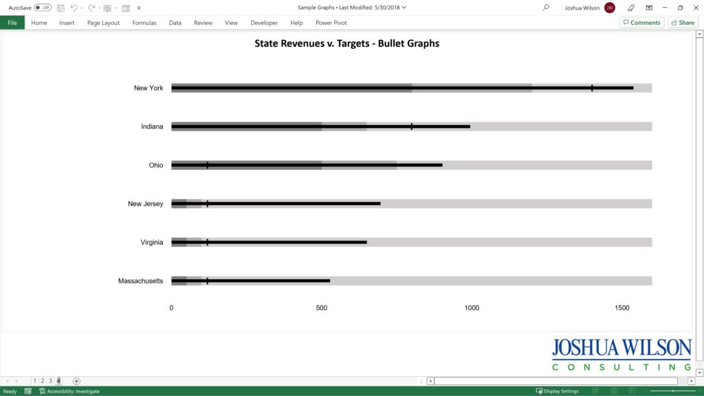
Bullet Graphs – State Revenue Compared To Targets created by Joshua Wilson in Microsoft Excel
Custom Graphs, Charts & Visualizations
Simplifying. Illuminating. Empowering.
The Excel dashboarding process starts with a single graph.
Our graph consultants design custom graphs, charts, and diagrams that visually explain relationships between data points, help viewers explore the numbers, and communicate your message. Our graph consultants design custom charts in multiple spreadsheet platforms, including Microsoft Excel and Google Sheets.
The default Microsoft Excel graphs are ugly, are clunky, use colors that are too bright, and generally have too much chart junk. Our bespoke graphs educate your audience simply, clearly and without distraction.
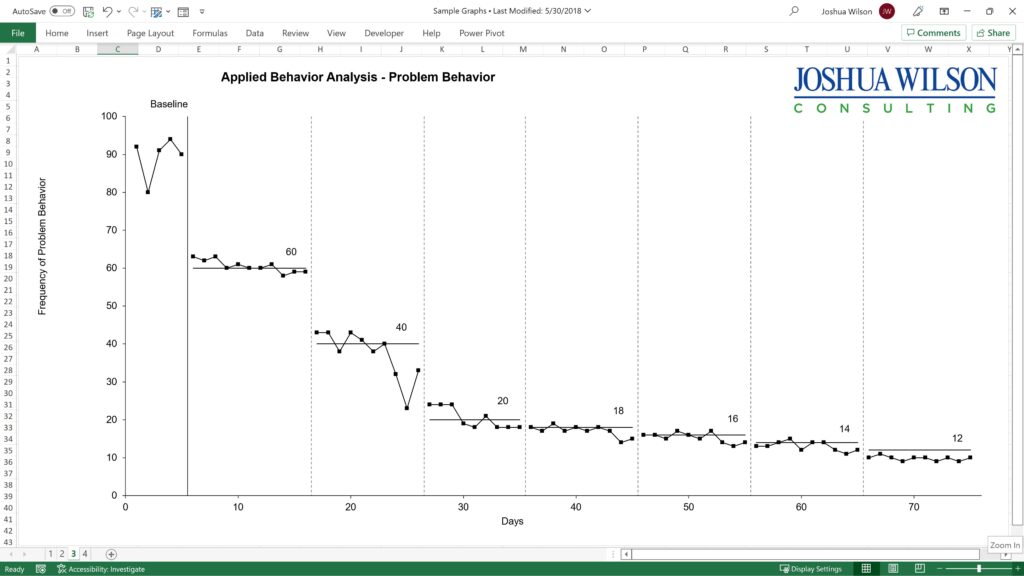
Applied Behavior Analysis Problem Behavior Graph created in Microsoft Excel by Joshua Wilson
Custom Chart & Graph Design Best Practices
When we create a custom graph in Microsoft Excel, our graph designers start with the ‘out of the box’ Excel graphs, then make the following improvements:
Choose the best graph to fit your data. Even expert graphing consultants will often graph a data set multiple ways. This graph consulting process identifies the most effective way to communicates the data set’s story–as simply as possible. This essential step is easier said than done. It takes experience and often a knack for communicating data visually. Graph consulting, when done well, makes the message jump of the screen to the viewer.
Remove grid lines and unnecessary ink. A graph best communicates its data set’s message when it does so simply–maximizing the message while minimizing ink used. By default, Microsoft Excel graphs use more grid lines than are necessary, so our graph designers typically eliminate most or all of the grid lines on our custom charts.
Lighten overpowering colors. The Microsoft Excel default graph colors are not good. They overwhelm the eye. When we make a custom graph, our chart designers lighten these overpowering colors to more pleasant earth tones. Skilled graph consultants exclude everything that is not absolutely necessary.
Read Stephen Few. We’ve studied visualization pioneer Stephen Few in detail. We own three of his books, and have spent hours reading his blog and publications.
You don’t need to spend a lot of time trying to communicate complex relationships. With Joshua Wilson Consulting you get data literacy at a glance. Whether you need customized Microsoft Excel Charts or Google Sheet graph design, put our graphing consultants to work for your business. Once you have professional graphs, Excel dashboard designs are often the next step.


