

Background
Autism Parent Care is a school for children with autism. Autism Parent Care uses Applied Behavior Analysis (ABA) therapy to help children with autism overcome behavioral problems.
Challenge #1
The Applied Behavior Analysis (ABA) industry uses a standardized graph format for presenting data in professional journals and textbooks. Founder Dr. Jane Yip and her colleagues needed Microsoft Excel graphing templates to chart student behavior progress and to submit articles to scholarly journals. There is no easy way to create ABA Excel graphs, particularly with things like phase lines, flat goals, variable goals, and graphing multiple shapes.
Solution #1
I created a series of ABA Excel graph templates for Dr. Yip’s team. I started with a table where Autism Parent Care team members can enter goals and data.

Then I created a Microsoft Excel graph that will update as the data is entered. The first set of points in the top left is the baseline. The flat lines are the goals, and the other points are the behavior. These first 2 graphics are for flat goals, represented by the flat lines.

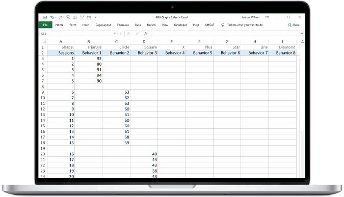
In the field of Applied Behavior Analytics (ABA), sometimes many different shapes are needed to graph varying behaviors. For the next template, I set up a table that will accommodate different shapes, including triangles, circles, squares, X’s, plus signs (+), stars, flat lines, and diamonds.
Below, you can see our 8 shape ABA Excel graph template in action.

Here is an example of our 8 shape template tab filled out with a lot of data for each shape.

And here is the ABA Excel graph with many shapes and data points–kind of an extreme example!

This template table accommodates phase lines. The phase lines, which you can see in action in the next graphic.

The vertical lines are ABA phase lines. The first line separates the baseline from the other data. The dotted lines separate different test periods. Note that the flat lines are goals, so this template uses flat goals and adds phase lines.

But, what if there is a variable goal? No problem, here is an example of our table for variable goals with phase lines.

And below, you can see the variable goals with phase lines in action.

Excel doesn’t accommodate putting in the phase lines very easily. So, we left Dr. Yip’s team with annotated instructions to get their phase lines where they need to be.

Finally, we created summary grids to serve as a quick reference when contrasting and comparing the various ABA Excel graph templates.

Challenge #2
Dr Yip and her team liked our ABA Excel graph templates, and so they gave me another project to help with business planning and organization. Autism Parent Care needed a way to track projects, to evaluate employees, to evaluate ABA programs, and to track projects in a more task-based format. So, I employed my Microsoft Excel Spreadsheet design services.
Solution #2
I came up with an Excel Gantt Chart for tracking projects. I utilized the Likert scale (0-5) with Excel data bar graphs, and summary sections for the evaluations. I also presented a project/task list in grid format.
Here is the Excel Gantt chart to track projects. The purple shows the length of the project, and the gray shows the percent that is completed.

For the employee evaluations, the evaluator enters a number (0-5) for each item, and the data bar graphs give a quick visual. I used light colors that do not overpower.

There are a couple of levels of summary sections, and the graphs get progressively darker for the summary levels.

I made the summary sections collapsible, so that Dr. Yip’s team can view the high level summary without distraction.

Again, I applied the Likert scale for the ABA Program Evaluation Excel data bar graphs.

Again, the summaries are darker.

Finally, I presented a grid based approach to projects and tasks.

Be sure to also check out our Custom Excel Dashboard Design Service!